


In an era where the digital realm is accessed through a myriad of devices ranging from smartphones and tablets to laptops and desktops, the significance of responsive web design cannot be overstated. With the exponential growth in mobile usage, businesses must adapt to ensure their online presence remains accessible and engaging across all platforms. In this blog post, we delve into the importance of responsive web design in today’s multi-device world and explore how it can revolutionise user experience and enhance SEO efforts.

Understanding Responsive Web Design
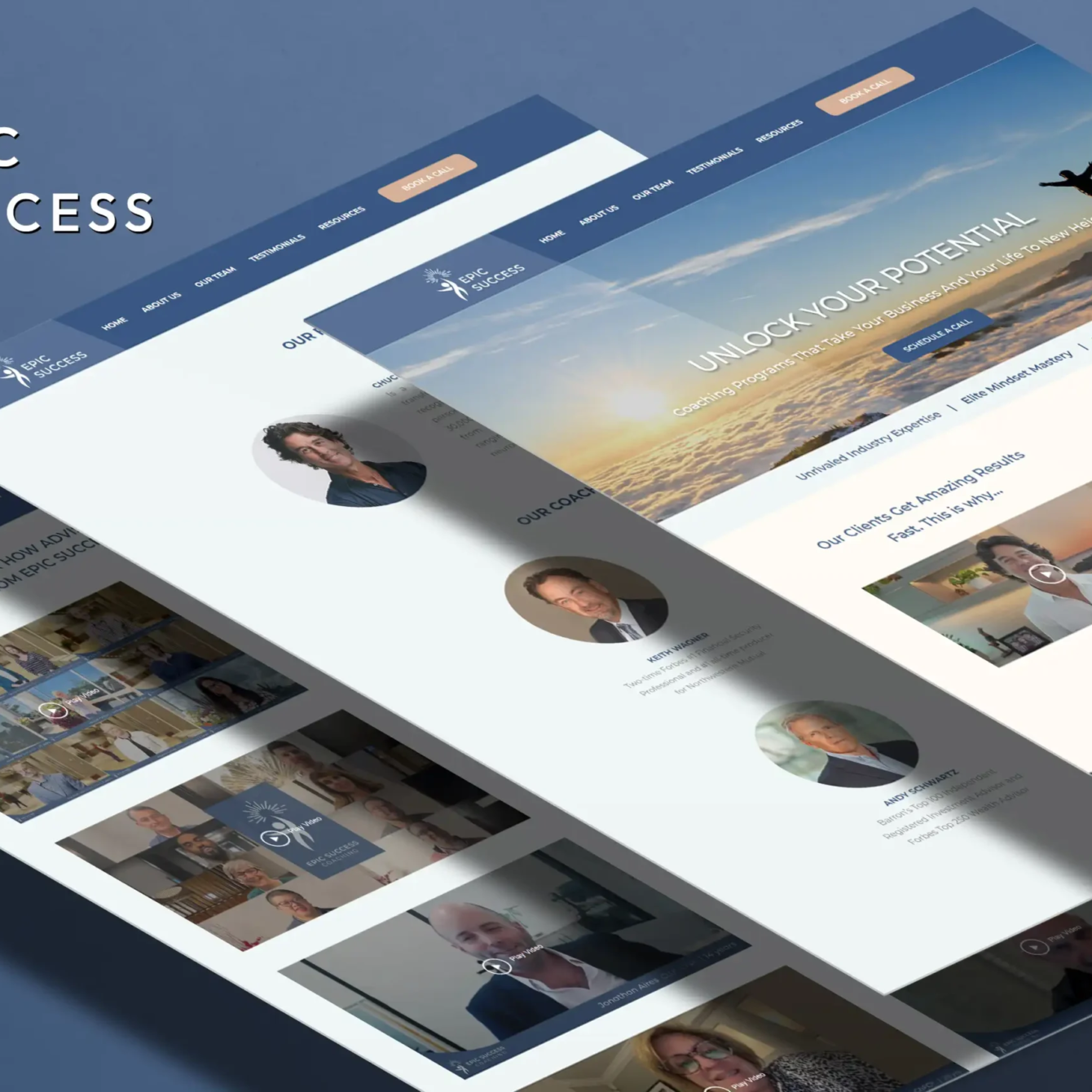
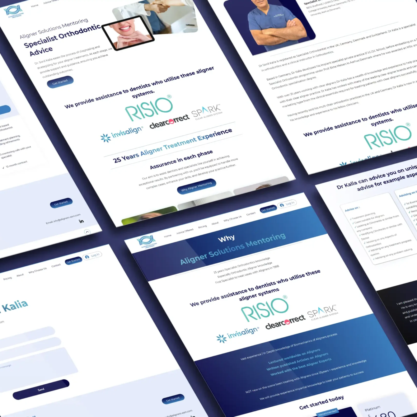
Responsive web design is an approach to web development that aims to create sites that provide an optimal viewing and interaction experience across various devices and screen sizes. Rather than maintaining separate websites for different devices, responsive design utilizes flexible layouts, fluid grids, and scalable images to adapt seamlessly to the user’s screen size and orientation.
Enhanced User Experience
One of the primary benefits of responsive web design is its ability to deliver a consistent user experience across all devices. Whether a visitor is accessing your website on a smartphone during their morning commute or on a desktop computer at the office, responsive design ensures that they can easily navigate and interact with your site without encountering any usability issues.
By providing a seamless experience, responsive web design fosters user engagement and encourages visitors to spend more time exploring your content. This can lead to lower bounce rates and higher conversion rates, ultimately driving business growth and increasing revenue.
Mobile-Friendly Ranking Factors
In addition to enhancing user experience, responsive web design plays a crucial role in search engine optimization (SEO). In recent years, major search engines like Google have placed a significant emphasis on mobile-friendliness as a ranking factor. Websites that are not mobile-friendly may be penalized in search results, making it harder for users to discover your content.
By implementing responsive design principles, you can ensure that your website meets Google’s mobile-friendly criteria, improving its chances of ranking higher in search results. This can result in increased visibility, organic traffic, and ultimately, more leads and conversions for your business.

Cost-Effectiveness and Maintenance
Another advantage of responsive web design is its cost-effectiveness and ease of maintenance. Rather than investing resources in developing and maintaining separate websites for different devices, responsive design allows you to manage a single site that automatically adjusts to meet the needs of various users.
This not only reduces development costs but also streamlines ongoing maintenance efforts, as updates and changes can be applied universally across all devices. As a result, you can allocate your resources more efficiently and focus on creating valuable content and improving the overall user experience.
In today’s multi-device world, responsive web design is no longer a luxury but a necessity for businesses looking to thrive online. By embracing responsive design principles, you can deliver a consistent and engaging user experience across all devices, enhance your SEO efforts, and drive business growth. Whether you’re a small business or a large enterprise, investing in responsive web design is essential for staying competitive in the ever-evolving digital landscape.